Create a screen layout
If none of the default layouts fit your needs, you can create a custom layout for your specific purpose.
In this example, we will design a reception screen layout with a welcome header, clock, logo and two channel areas for bookings.
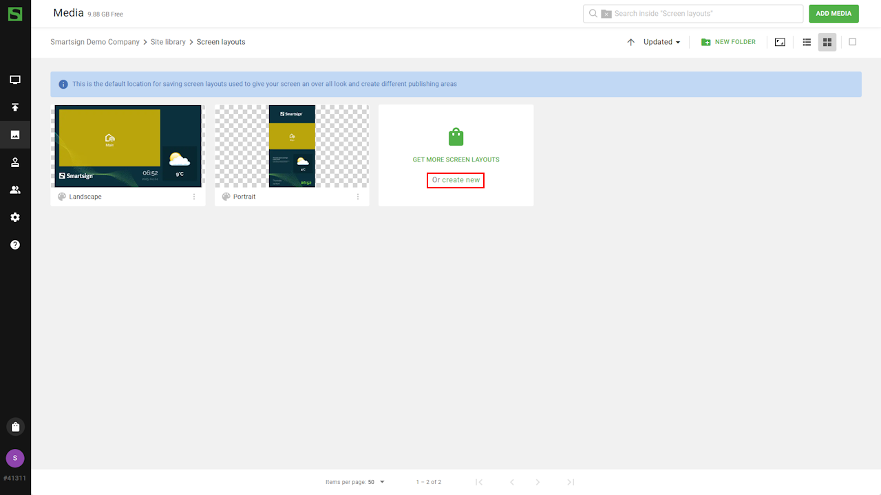
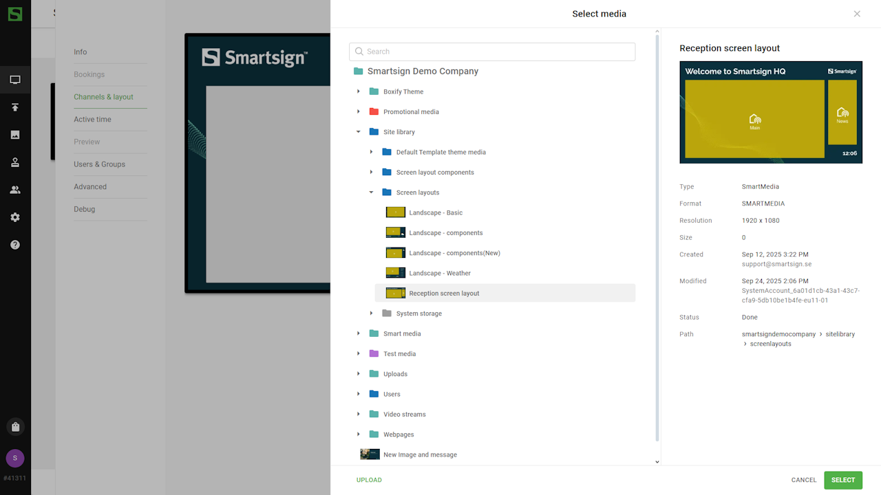
While it is possible to store layouts in any folder within the media library, it is recommended to keep them in the Screen layouts folder for better organization and easier access.
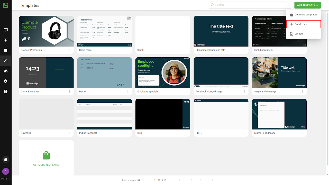
To create a new layout, open the media library and select Create new
to open the tool.
Video guide
Layout settings
First, we will setup the layout settings and add the necessary resources needed to build the design we want.
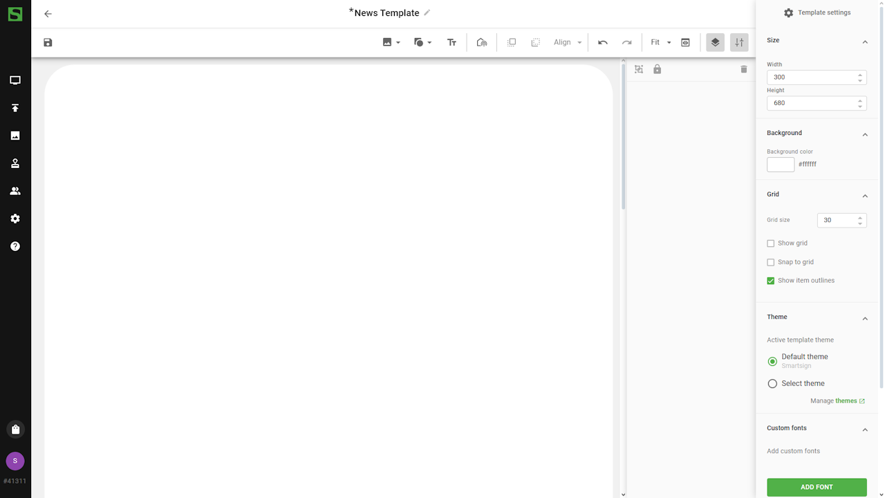
Name
Give your layouts clear, descriptive names so their purpose is easy
to understand. This is especially important if you use different
layouts for different needs.
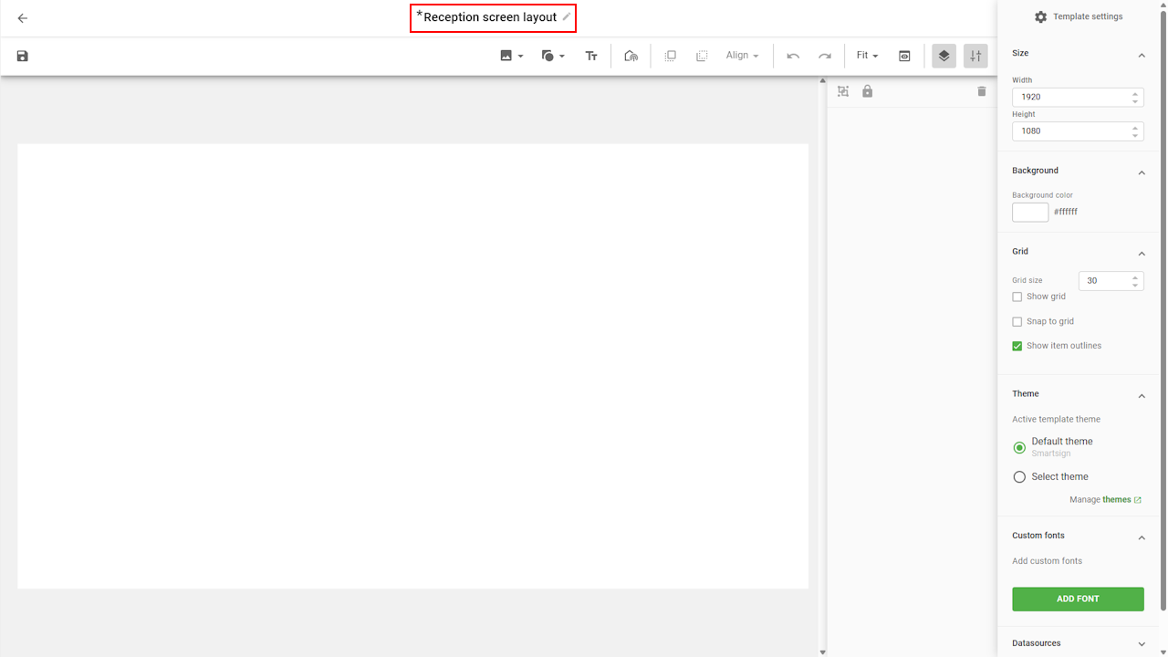
Size
Use the Size settings to set the target width and height for the layout.
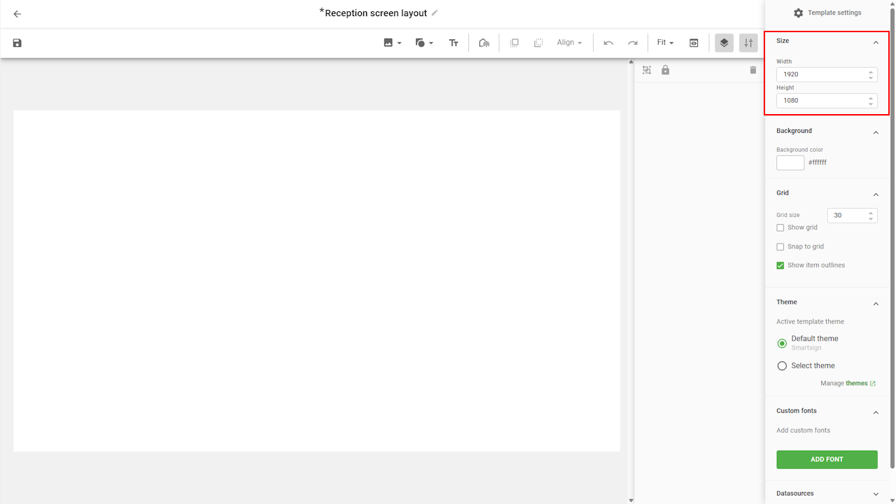
These values act as a reference resolution. If the layout is shown on a screen with a different resolution, Smartsign automatically scales it proportionally based on the target size you configured.
For example, if you set the target size to 1920×1080 but use the layout on a screen with 3840×2160, the layout will scale up evenly to fit.
Set the target size to match the most common resolution and orientation in your environment. This ensures layouts scale consistently across all screens.
If you are designing for a portrait screen, always set the target size to match the portrait orientation. Otherwise, scaling may not look as intended.
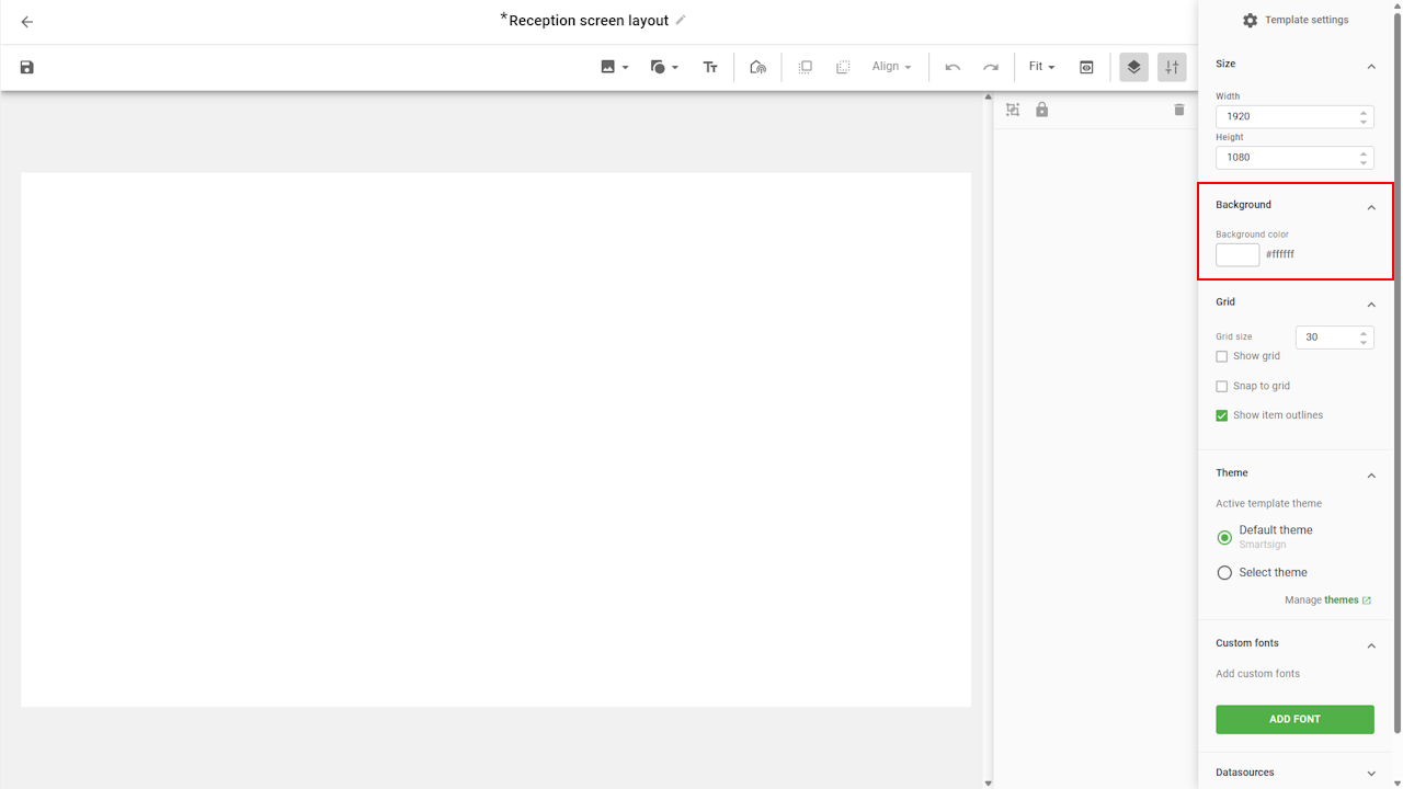
Background
The background tab allows you to set a plain background color of the
layout. It is mainly used if you don't use any background image
in the layout.
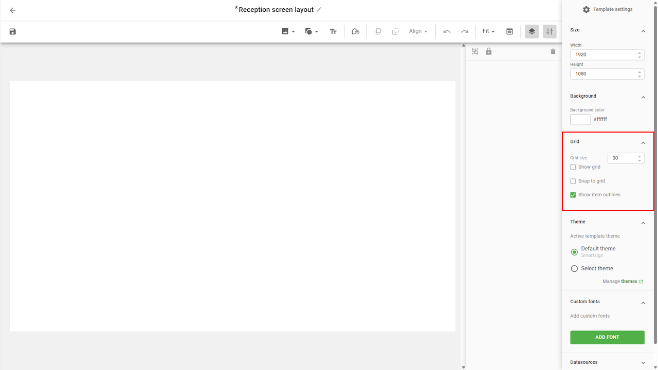
Grid
The grid helps you position and align objects more easily, especially
when dragging them with the mouse.
Enable it by selecting Show grid and Snap to grid, then adjust
the grid size as needed.
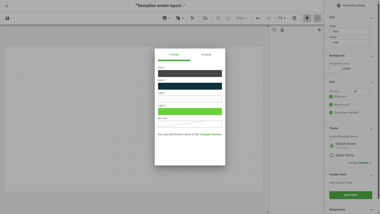
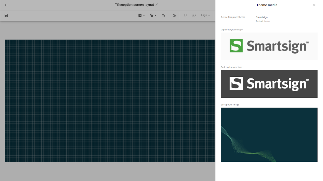
Theme
The theme is a collection of logos, fonts and colors that can be
applied to screen layouts or templates to ensure a consistent and
professional appearance. Using a theme makes it easy to style your
layouts without designing every detail from scratch.
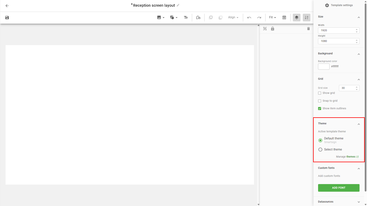
You can choose to work with the default site theme, or switch to another theme if you manage multiple graphical profiles. This gives you quick access to the media and design assets linked to each theme.
For added flexibility, you can also override theme settings by applying custom colors directly to a layout or template. This allows you to adapt the design for specific needs while still maintaining overall consistency.
Learn how to set up themes in the Theme guide.
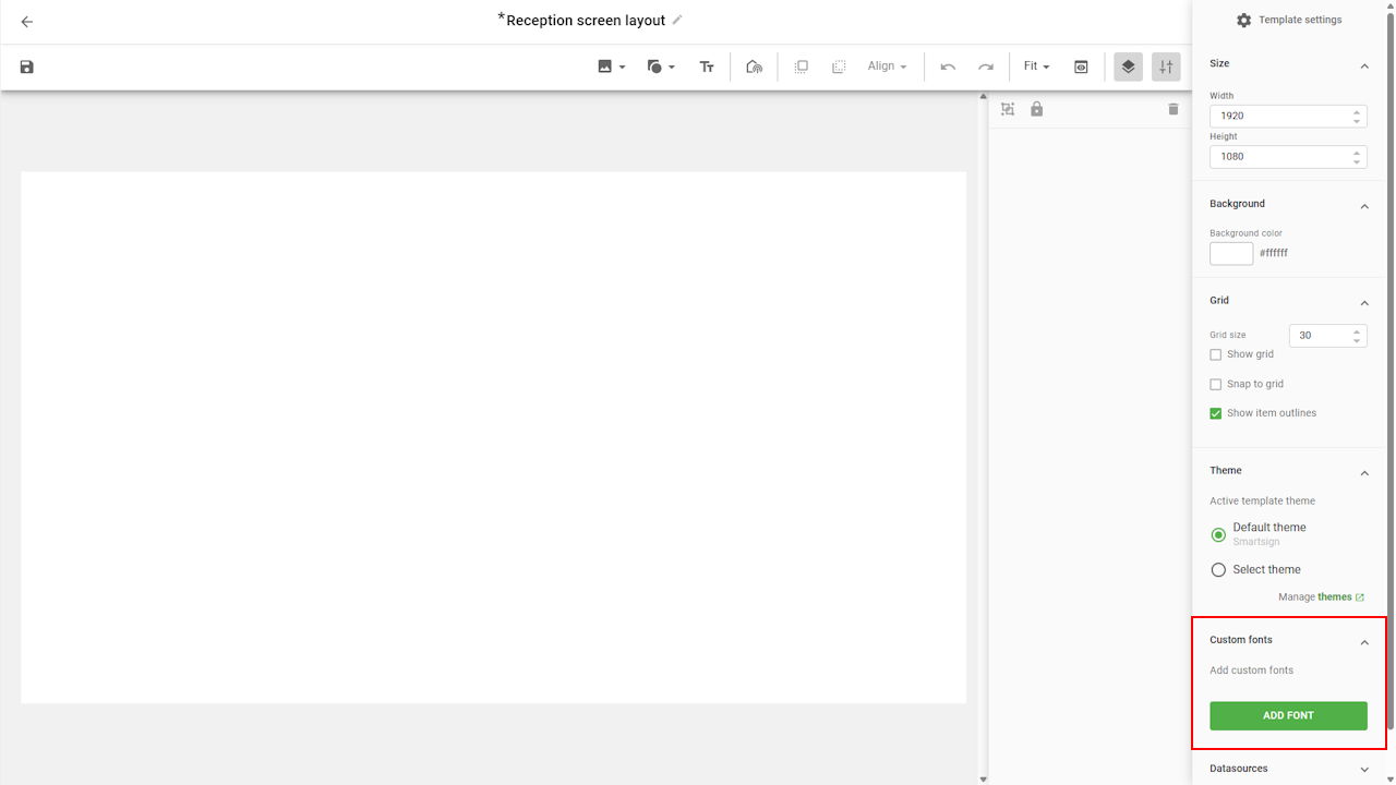
Fonts
The Fonts tab lets you add additional fonts to your layout if you
don’t want to use the standard fonts or those provided by your theme.
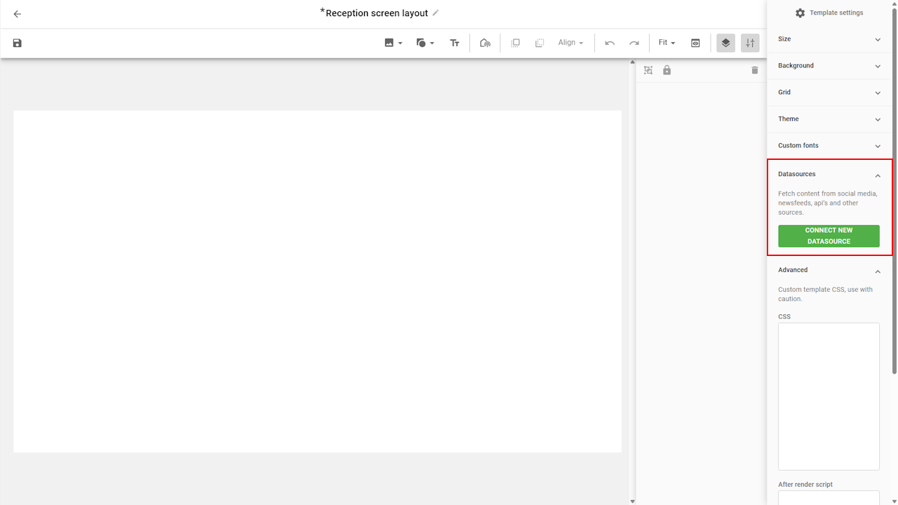
Datasources
The Datasources tab allows you to connect datasources directly to
the layout, instead of relying only on screen layout components.
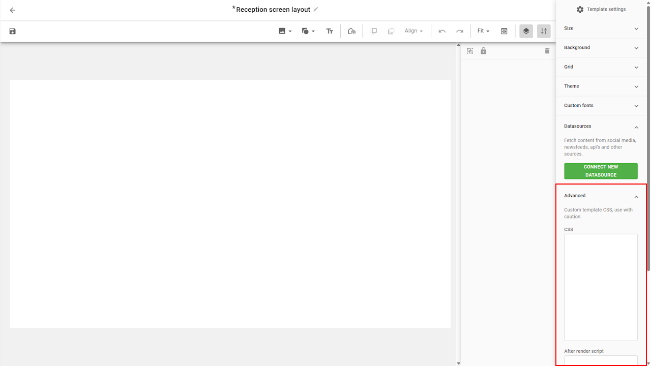
Advanced
The Advanced tab provides access to features like custom CSS or scripts.
These options are intended for advanced use cases and should only be
used if you have the necessary technical knowledge.
Designing the layout
The first step in designing your layout is to define the background. You can either use a solid color or an image.
Adjust the background
Background color
To change the background color, select it in the settings tab
and choose a color. You can select a theme color for consistency,
or pick any custom color using the other tab.
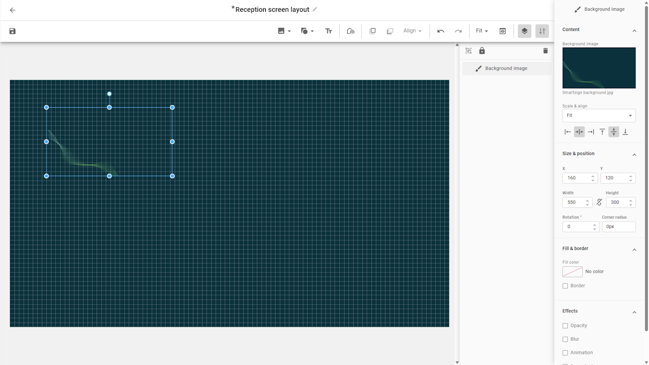
Background image
If you prefer an image background, use the toolbar to add an image
from the Media library or select one included in your theme.
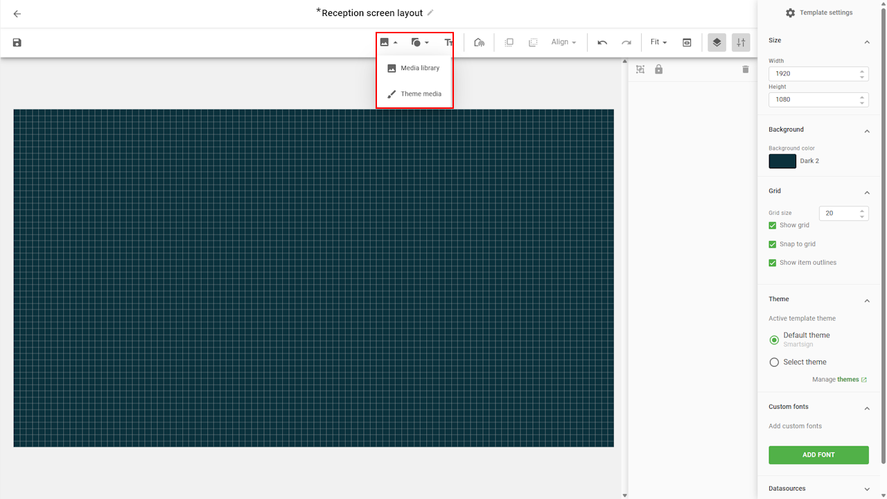
Once the image has been added, you can adjust its size and position.
This can be done by dragging it directly in the layout or by
fine-tuning settings in the size & position panel.
For a full-screen background, set the image size to 1920x1080
(or match the resolution of your layout).
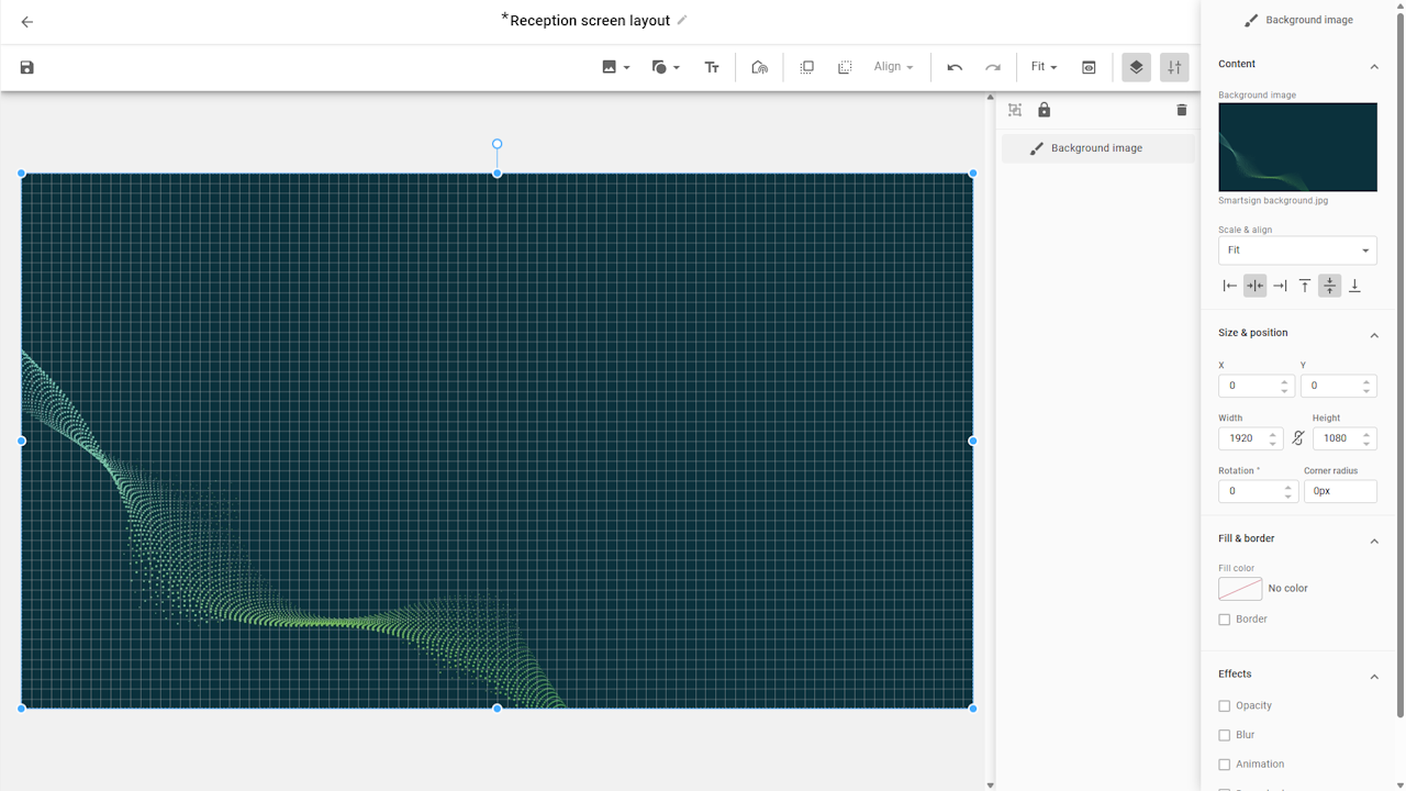
If you’re designing for portrait screens or non-standard resolutions, always adapt the background image to match your target size. This ensures it covers the entire layout without stretching or leaving blank areas.
Layers
A screen layout is made up of one or more layers, where each layer can hold elements such as text boxes, content channels, images, or other design components. By combining these layers, you can design a layout that fits both your content and your visual identity.
You can keep your layers organized by naming them clearly in the Layer menu to make it easier to manage complex layouts and quickly find the elements you want to edit later.
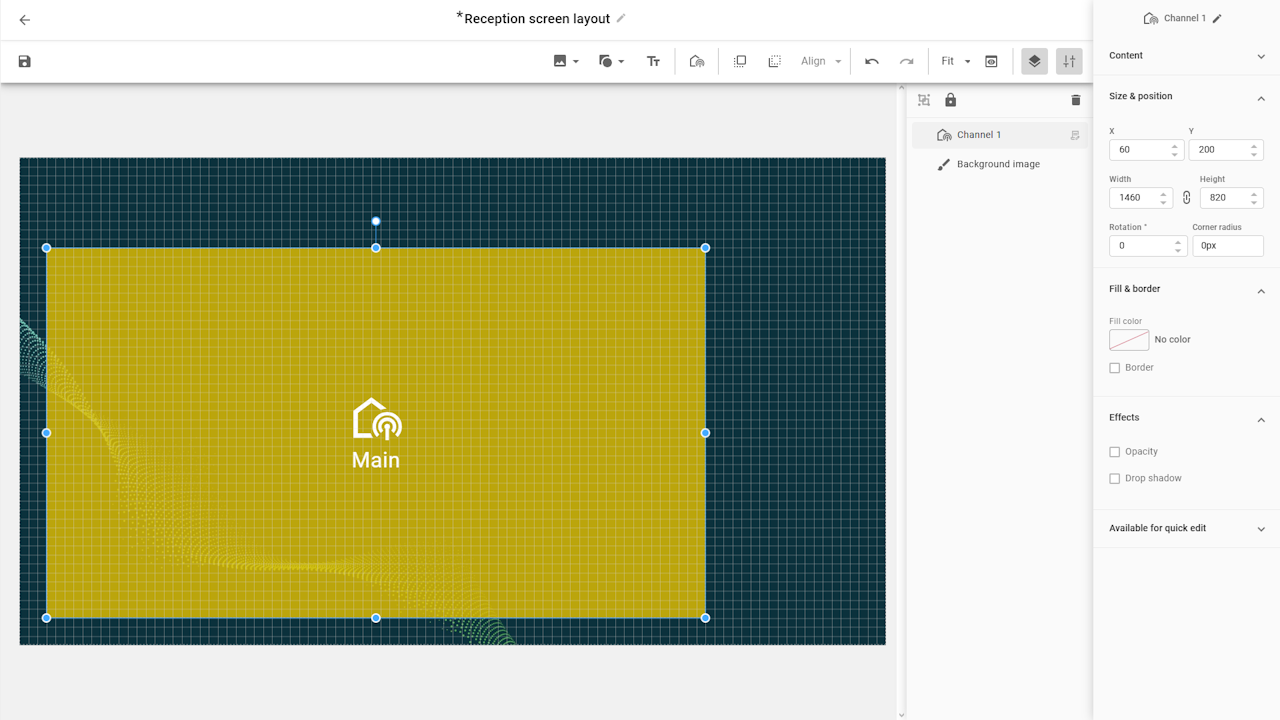
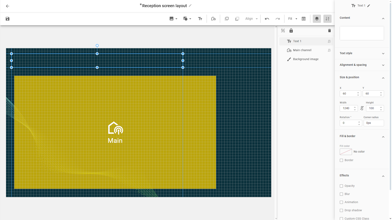
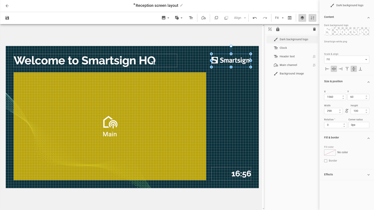
Add channel
We will start by adding the main channel layer to the layout, and set the size we plan to use first, then we add more layers for the other content.
- Select the add channel button in the upper toolbar.
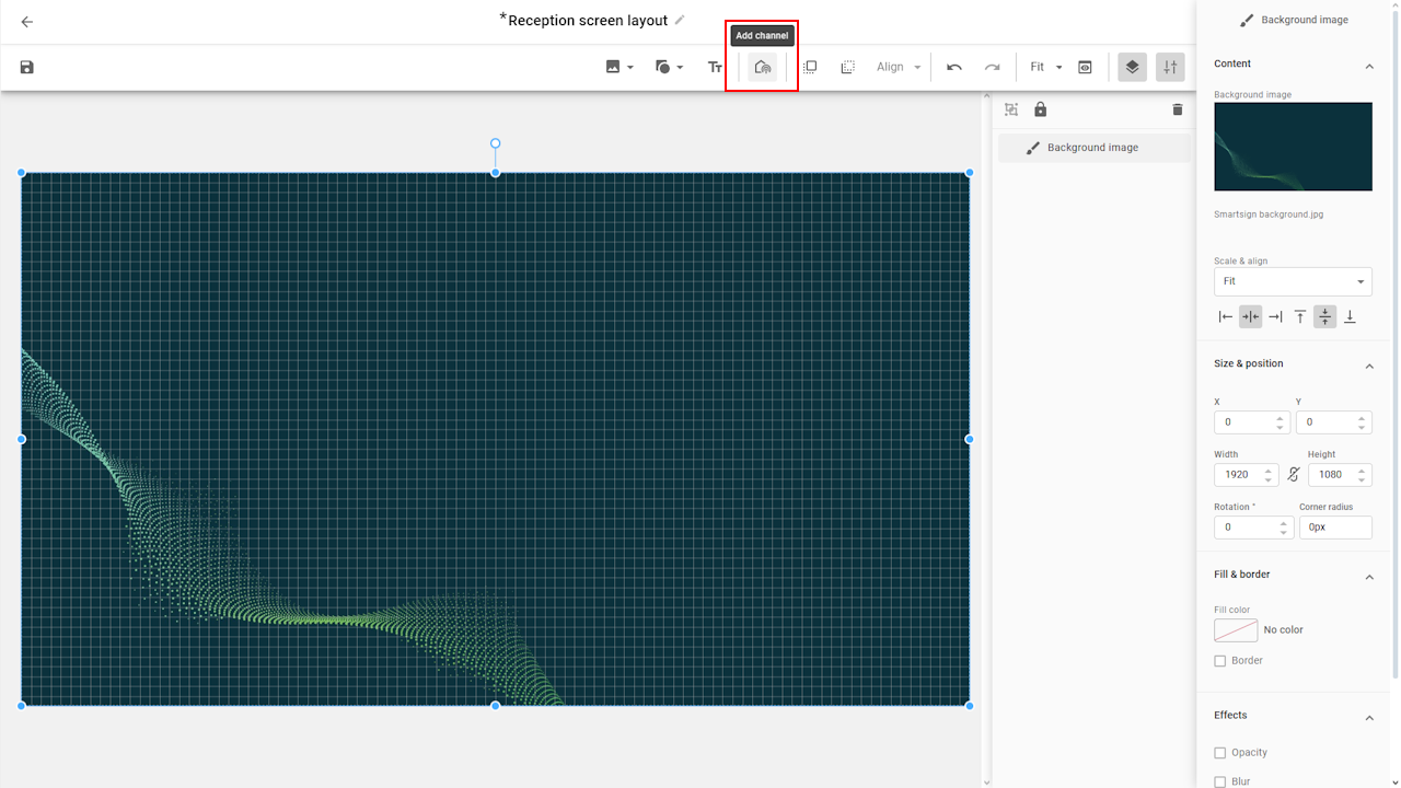
- Choose a channel for the area
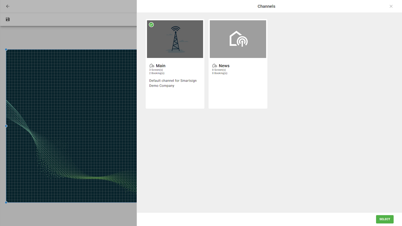
- When the channel has been added, we can adjust the size & position.
If you lock the proportions, you will keep the 16:9 aspect ratio of the layer which makes it easier to work with default content.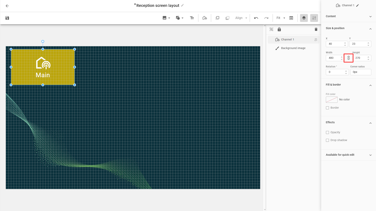
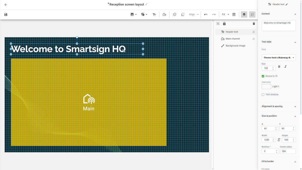
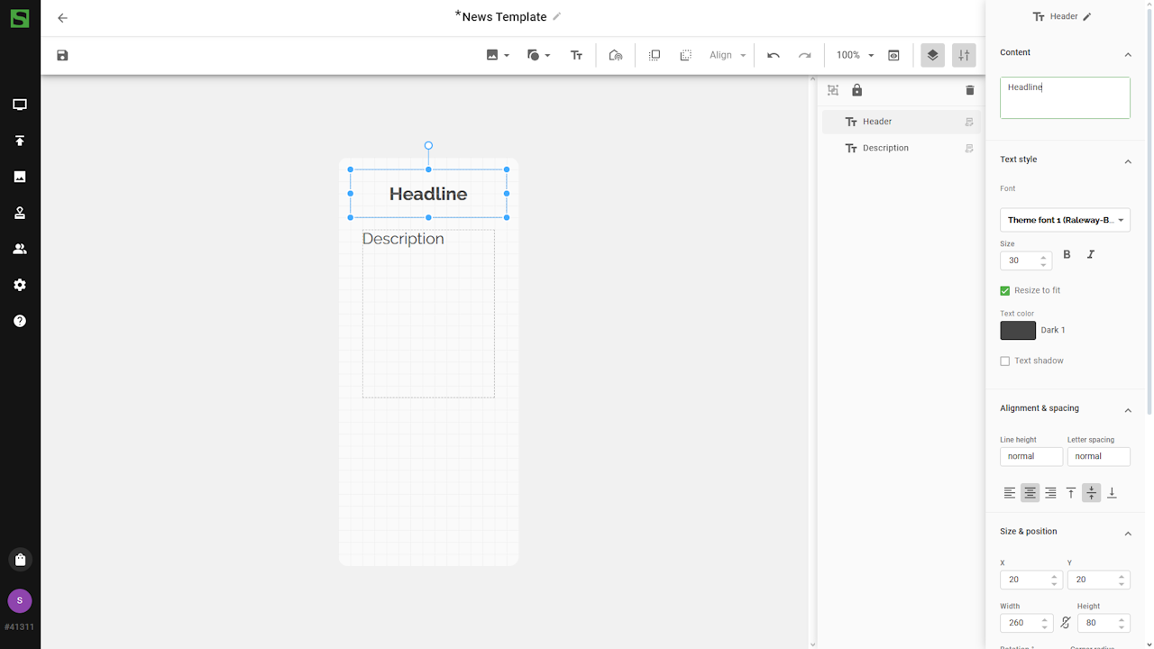
Text layer
Next up is a text layer to show a welcome message.
- Click the add text button and drag a box in the layout.
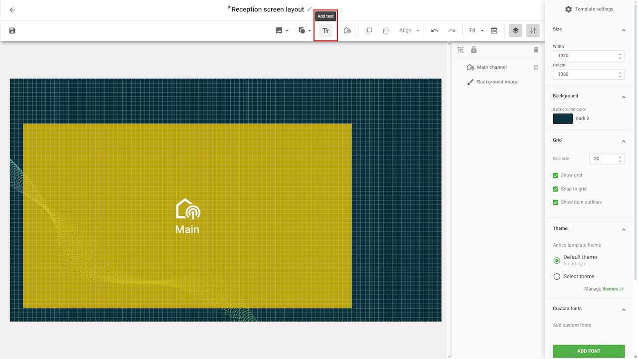
- Click and hold to adjust the position to the grid or other layers.
- Input text and adjust text style. You can also rename the layer
in the top right corner for easier identification.
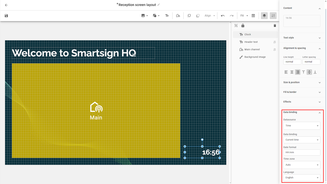
Clock
- Add a new text layer and adjust the style and position.
- Go to data binding tab and select Time datasource.
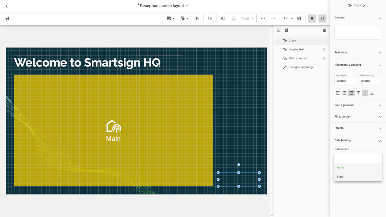
- Select data binding current time and adjust format and
time zone.
Logo
To add a logo from the site theme, we can repeat the steps as we did
with the background image.
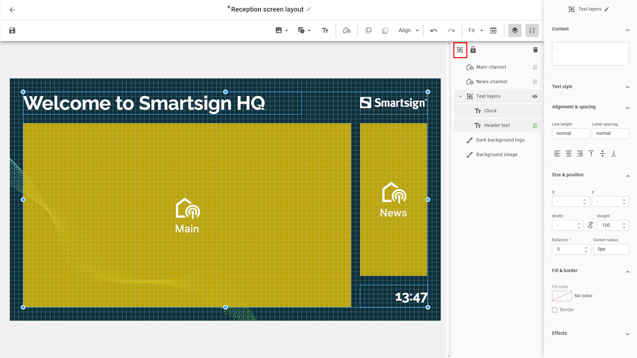
Add additional channels
The final thing we need to add is the second channel area, so we
repeat the steps we did with the main channel and place it in
the layout.

Since this layer area doesn’t match the standard sizes (300x680), we need to create a custom template that fits its dimensions. The steps for doing this are described further down in this article.
Layer menu
The layer menu allows you to see all the layers in your layout.

The order of items in the layer menu determines their depth position — in other words, which elements appear in front or behind others. This is often referred to as the Z-index.
Items placed lower in the list (such as a background image) will appear behind other elements, while items higher up will be shown on top — much like stacking papers on a desk, where the top sheet is the most visible.
The Z-index currently doesn’t affect channels, Smart Media,
or URLs.
These elements will always appear above all other layers, regardless
of the Z-index value.
Layer groups
You can keep your layout organized by grouping related layers
together. Groups make it easier to manage complex layouts, since
you can collapse or expand them in the list and quickly see which
items belong together. Giving each group a clear name also helps
with identification and navigation.
We have now completed the layout and can save it and apply it to the screens.
Applying the layout
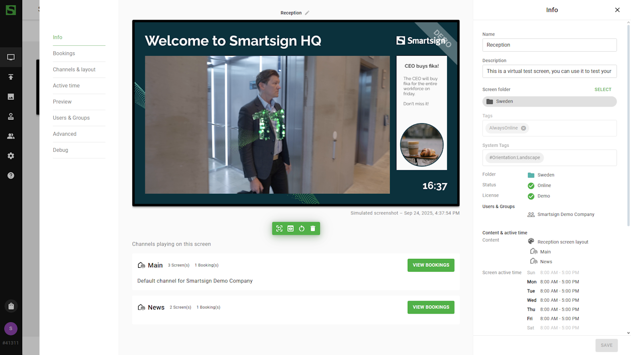
To apply the new layout, go to screen/folder details and select the Channels & Layout tab:
- Remove any existing layout.
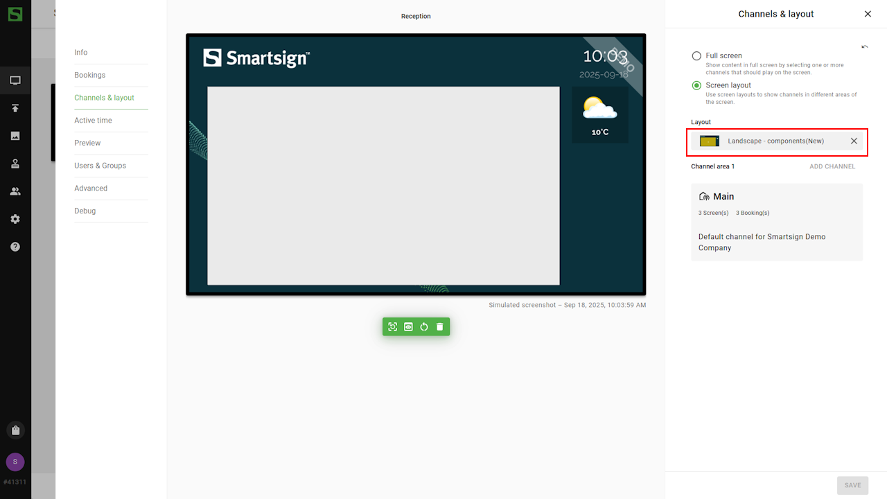
- Open Screen Layouts folder and select the new layout.
- Save the settings.
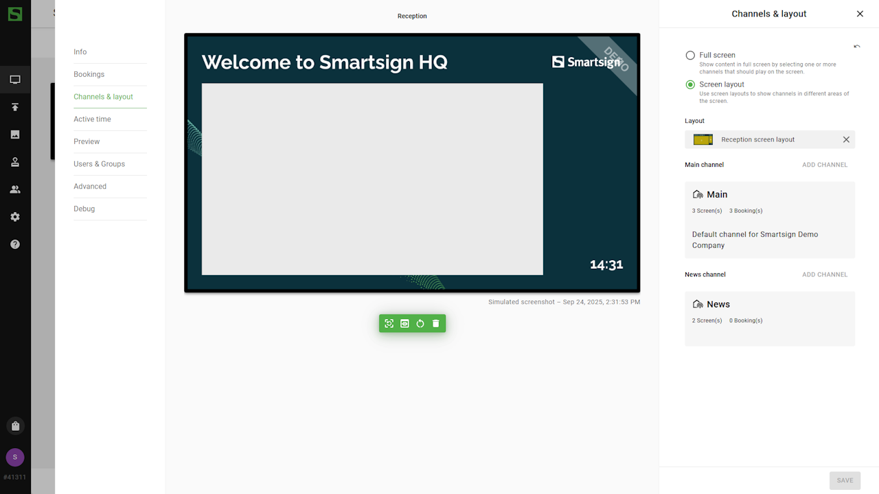
The layout will now appear on your screens and start playing the content already booked in the connected channels.
Since the main channel already uses a default size, no adjustments to templates or media are needed for it. However, as mentioned above, the News layer need a template that matches its custom size.
News channel template
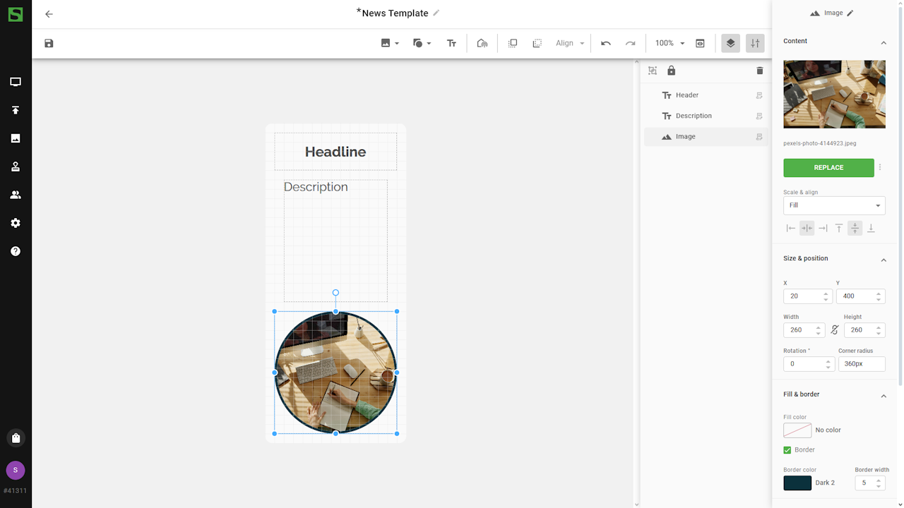
With the screen layout ready, we can now create a template for the News channel.
This template will act as a design frame and include placeholders for a header, description, and an image.
- Open the Templates menu and create a new template.
- Adjust the size to match the channel layer size (300x680).
- Add text boxes for the header and description, and adjust fonts
and other settings.
- Insert an image placeholder.
You can use any image while designing. The placeholder will
be replaced with an actual image when you publish a media from it.
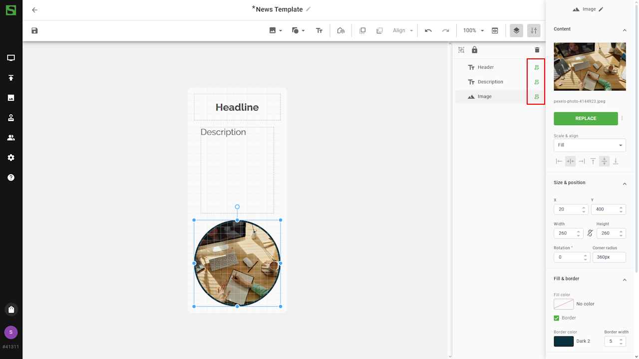
Quick edit
Quick Edit lets you edit layers without opening the template creator. It’s ideal when you just want to add a message and publish it quickly to the screens.
Quick Edit also keeps the pre-defined fonts and colors, ensuring that all content follows your visual identity.
You can enable Quick Edit for individual layers in the layer settings:
We can now save the template and use it to publish a message.
Publish news message
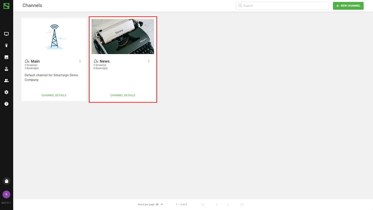
To publish a message using the template, go to publishing -> channels.
- Select the News channel.
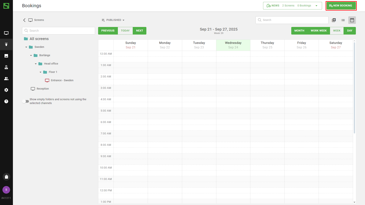
- Select New Booking.
- Click add media and use template
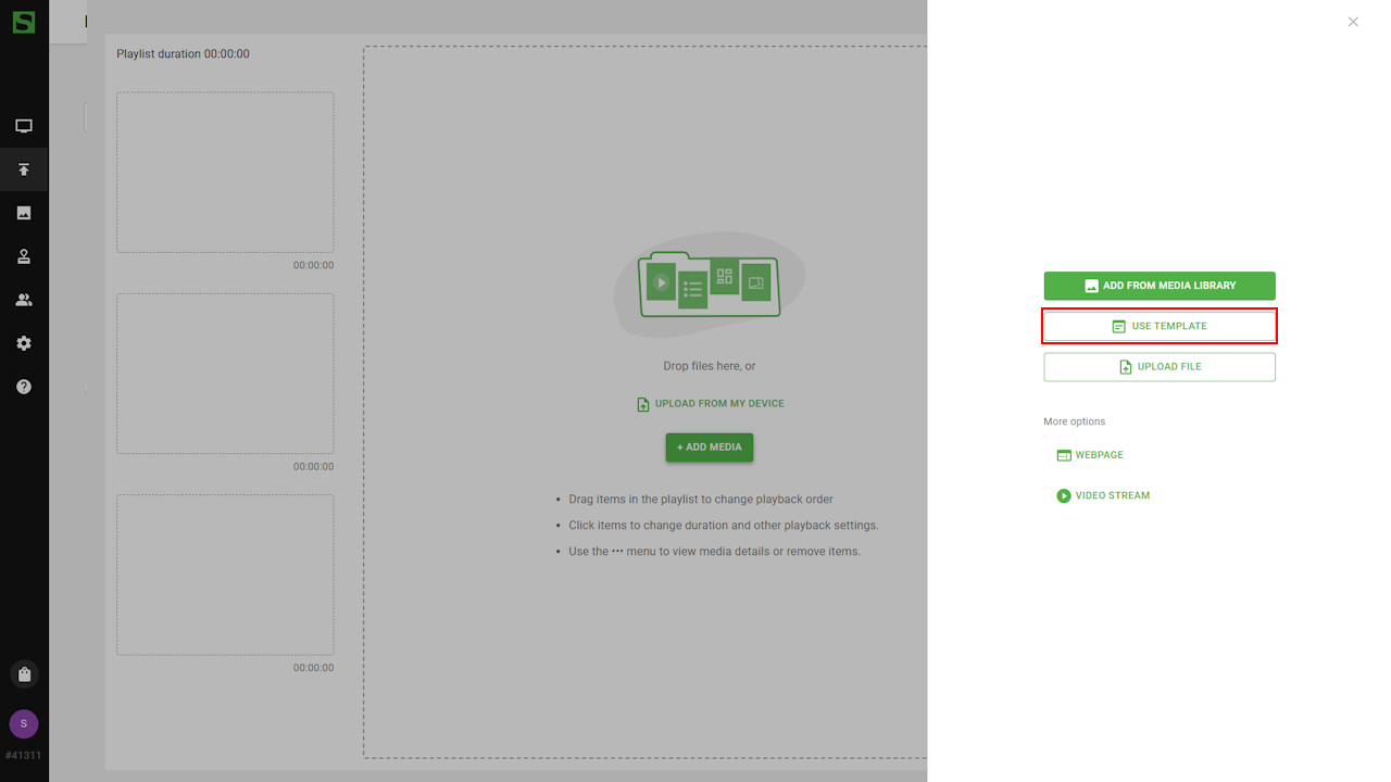
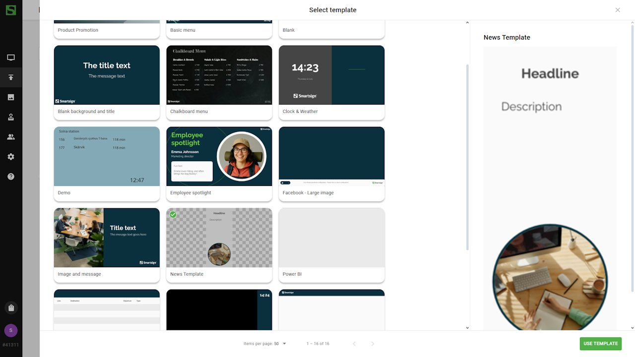
- Choose the news template.
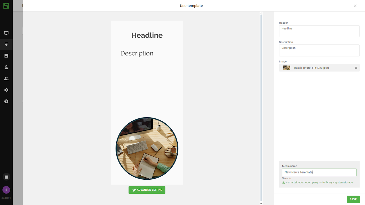
- Edit the content:
- Update the text fields
- Replace the placeholder image with one from the Media Library
or select a free image from the built-in Pexels library.
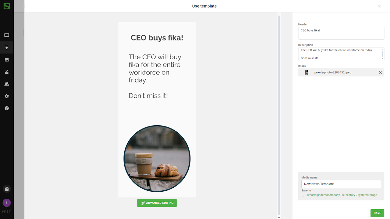
- Edit booking settings and save when finished.
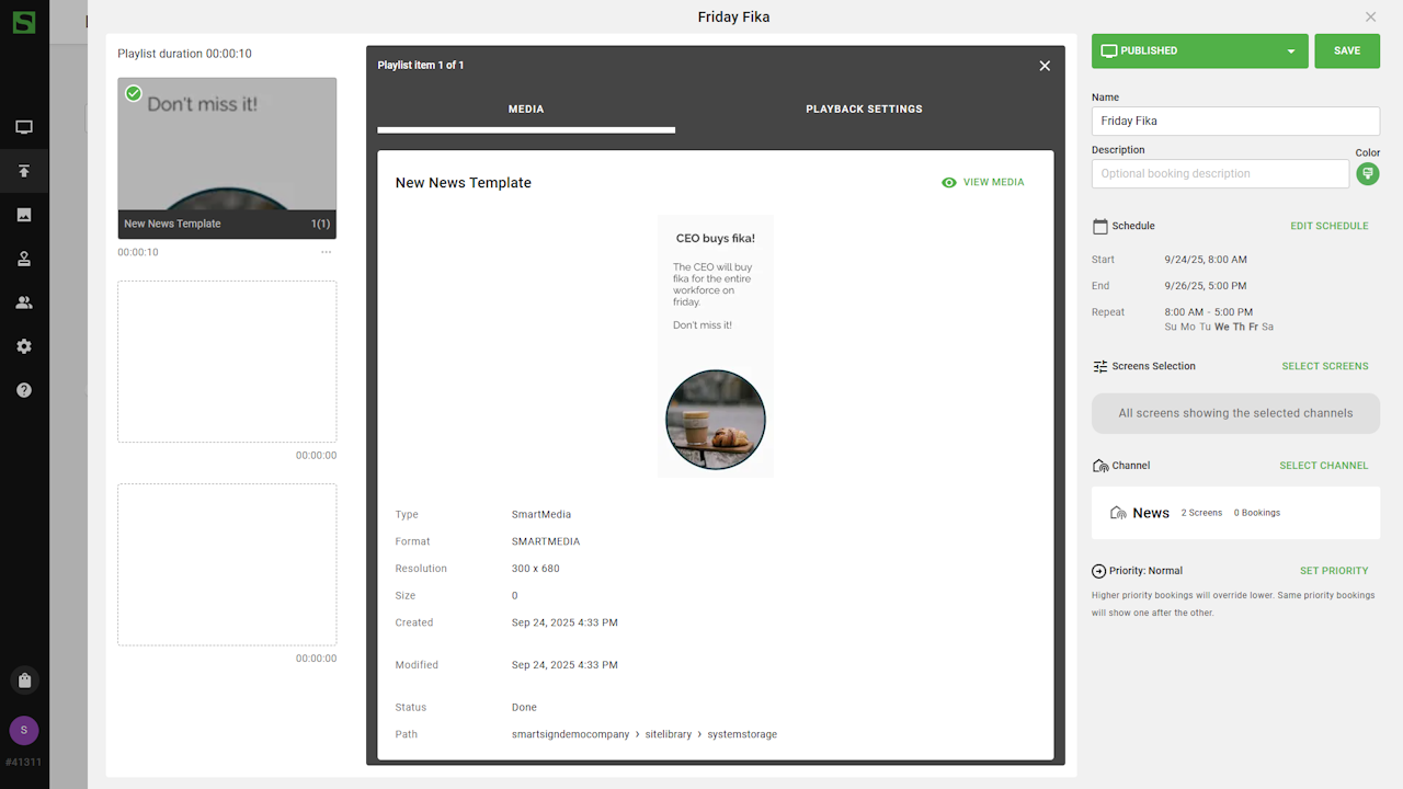
Screen will now show the message in the news channel area.